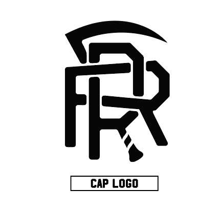
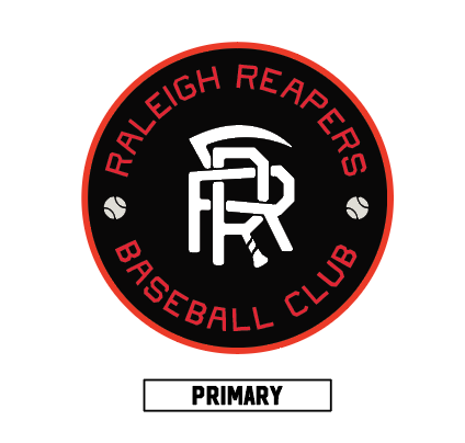
The Concept
In baseball, death takes many forms. Every out is a little death, and so is every loss. We embrace that death. Inspired by baseball’s rural roots, we approach each game as if it were a new harvest. Every inning’s end yields a bounty of possibility in the inning that follows. Death is inevitably followed by a rebirth, either with the next batter, the next game, or the next season.
The cycle begins again and we, the Reapers, await.
Behind the Design
The simplicity and heritage
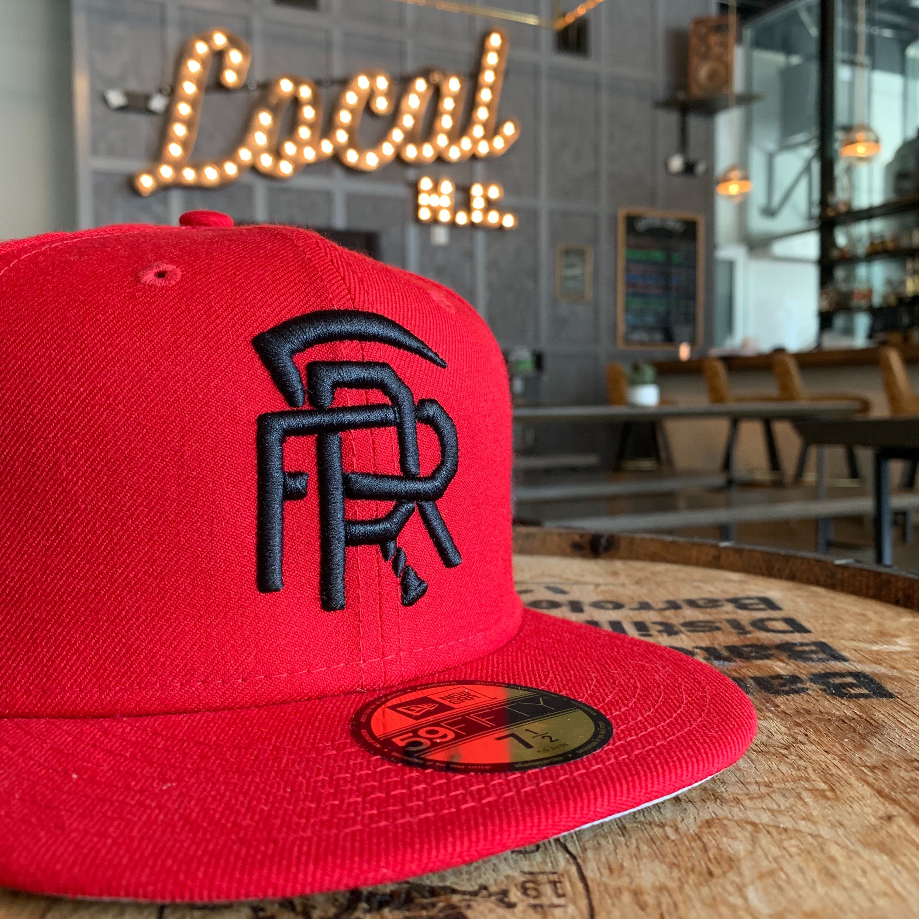
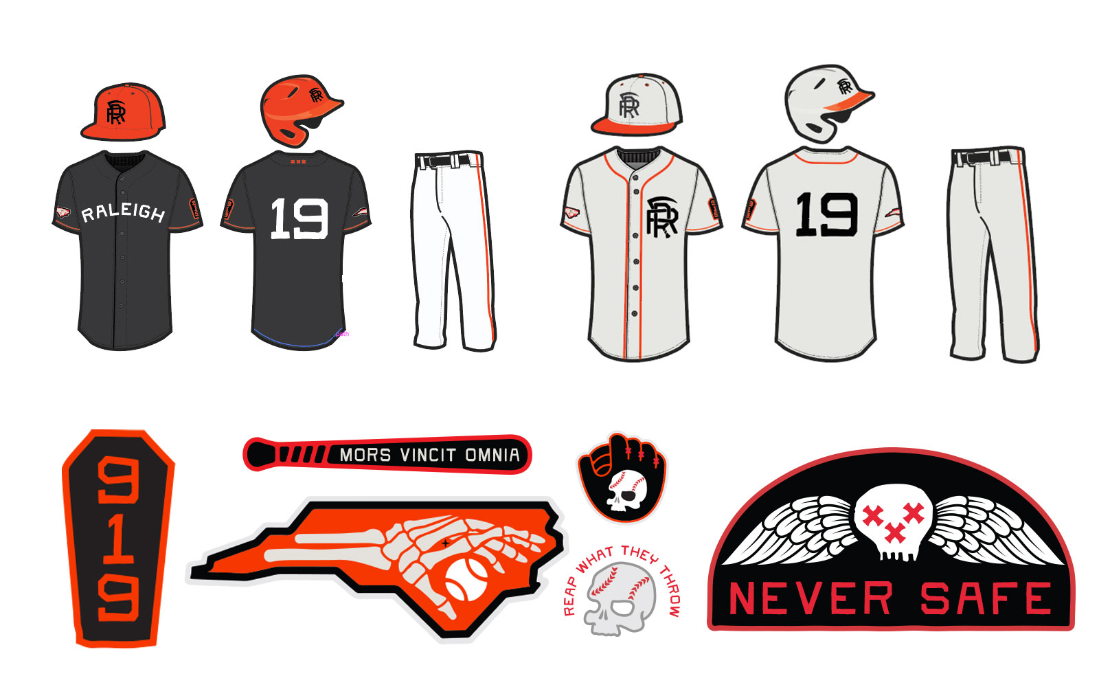
The Reapers were created as the charter team in Raleigh’s new Sandlot League. The team is built for (and by) people who dont just love the game, but love what the game represents.
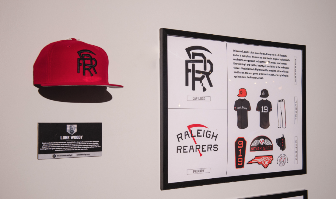
About the Designer
Luke Woody
Art Director
Raleigh, NC
Great work shouldn’t just look cool. It should tell a story. Luke uncovers that story that drives a brand and tells it to the world. He loves work that crosses all forms of media. Anyone can create a single great execution, but finding fresh angles to keep telling that truth again and again shows the true power of an idea. When he’s not working, he’s spending time obsessing over football, craft beer and new music.