The Concept
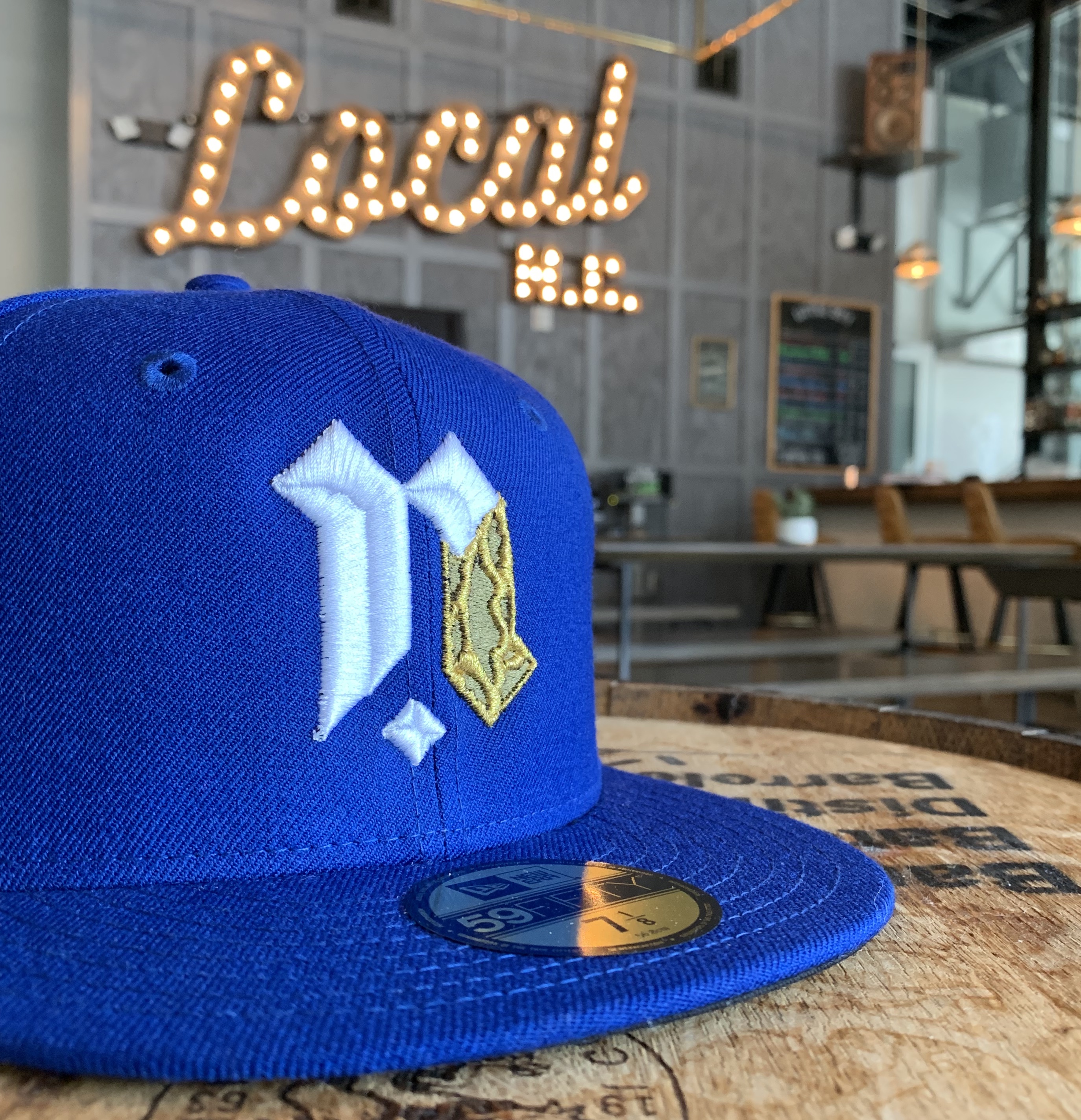
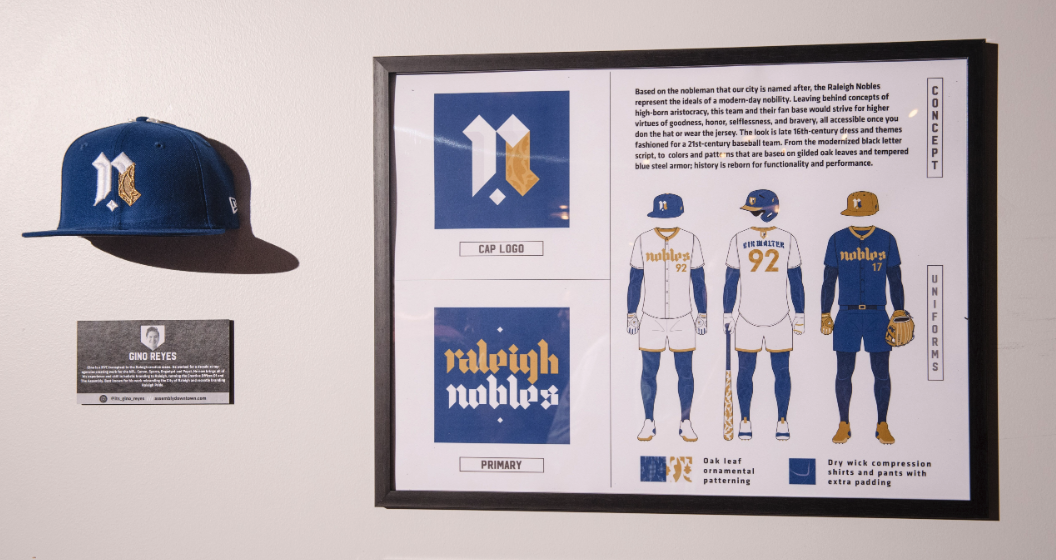
Based on the nobleman that our city is named after, the Raleigh Nobles represent the ideals of a modern-day nobility. Leaving behind concepts of high-born aristocracy, this team and their fan base would strive for higher virtues of goodness, honor, selflessness, and bravery, all accessible once you don the hat or wear the jersey. The look is late 16th-century dress and themes fashioned for a 21st-century baseball team. History is reborn for functionality and performance all the while emploring RALEIGH TO BE NOBLE.
Behind the Design
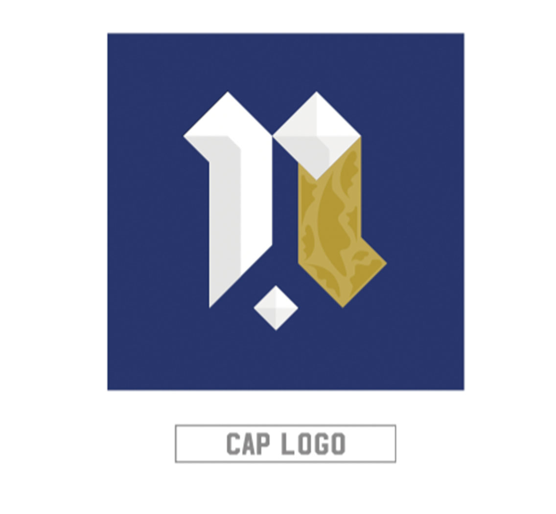
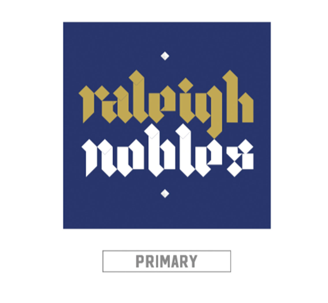
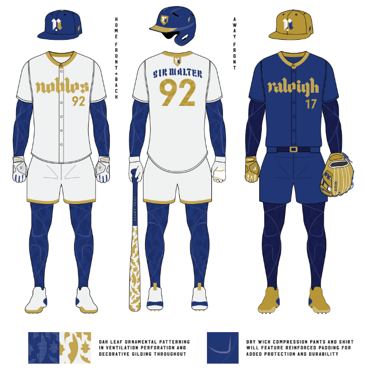
The logotype and typography is a custom modernization of black letter script. The cap logo is a lower case ‘r’ overlapped onto a lowercase ‘n’ illuminated with gilded ornamentation. This Oak themed ornamentation seen throughout is used for distinctive decoration as well as a ventilation design for the compression base layer. The colors represent various aspects from the 16th century, white for the purity of spirit, gold for gilding and embroidery, and tempered blue steel armor (fun fact: tempering armor to this blue color was popular at the time requiring a blacksmith to heat the armor up to 590° F). These colors then manifest themselves in the uniform which is completely based on the dress from Sir Walter’s time, i.e. hosiery, layers, embroidered patterns, livery collars, etc. Graphic diamond shapes also play a key role in the overall design as this is a reference to Sir Walter Raleigh’s Family crest. Other small details also include the feather/leaf in the caps (a popular motif of SWR) to signify glory in battle, a gold shield crest logo variant, and neckband typography proclaiming that we are part of a bigger NOBLE CAROLINA.
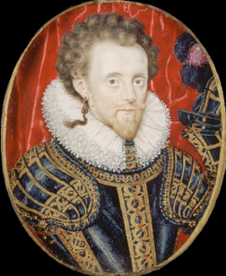
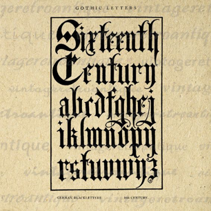
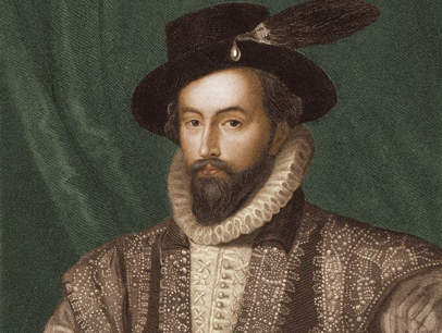
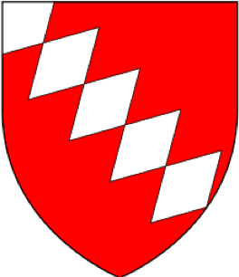
All players would be outfitted with a super dry wicking compression base layer to help with optimal performance and shorts for mobility. Completing the look is a more traditional jersey that can be tucked or untucked based on the preference of the player. Home kits would sport the team name on white/gold while the Away kits would represent the Nobles home city on armor steel blue/gold.
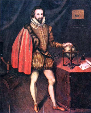
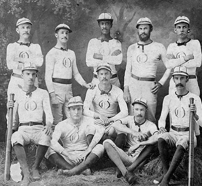
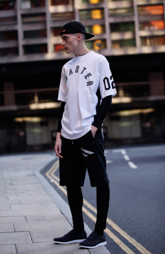
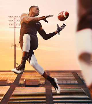
Final note: I purposely pushed this design away from the traditional baseball look by finding commonality in 3 different eras of fashion (noblemen, early baseball uniforms, and athletic/ streetwear). I did this in order to explore a uniform that would honor aspects of the past but recontextualize it for the future and current play. Thus yielding a refreshing high concept uniform that focused on function, comfort, and maximum performance.
About the Designer
Gino is a NYC transplant to the Raleigh creative scene. He worked for a decade at top New York agencies creating for clients like the NFL, Canon, Sperry, Engadget, and Pepsi Co. He now brings all of his experience and skill in holistic branding to Raleigh businesses and entrepreneurs running the Creative Offices Of and The Assembly. Best known for his work rebranding the City of Raleigh and most recently creating the brand for Raleigh Pride.
