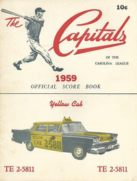
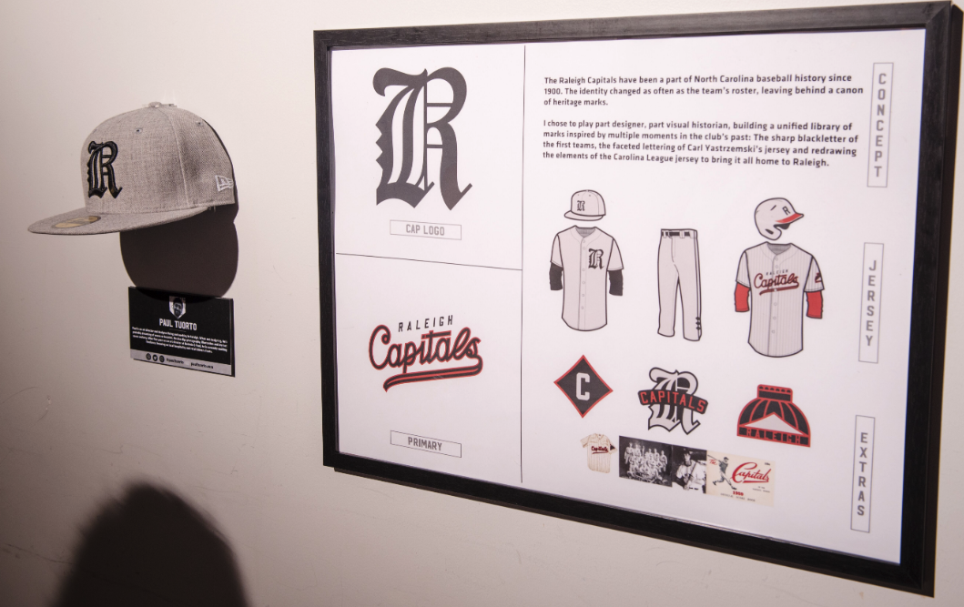
The Concept
The Raleigh Capitals are a huge part of North Carolina baseball history, with roots going back to the early 1900s. They were the minor league farm team for the Pirates and the Mets and were the first stop for a few baseball Hall of Famers, including Carl Yastrzemski and Enos Slaughter. This concept was all about truth, authenticity and respect for the team that started it all here in Raleigh.
Behind the Design
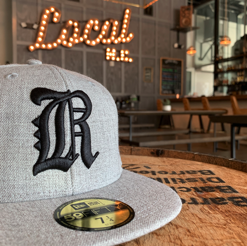
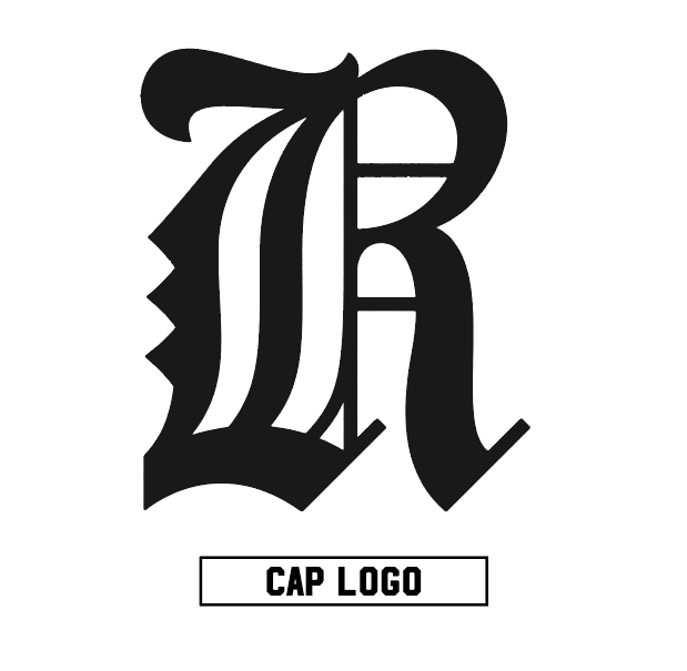
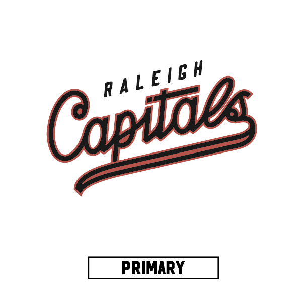
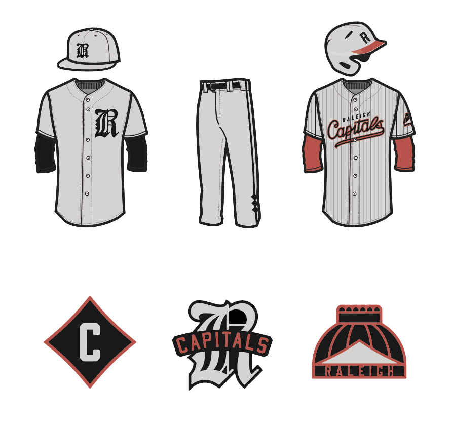
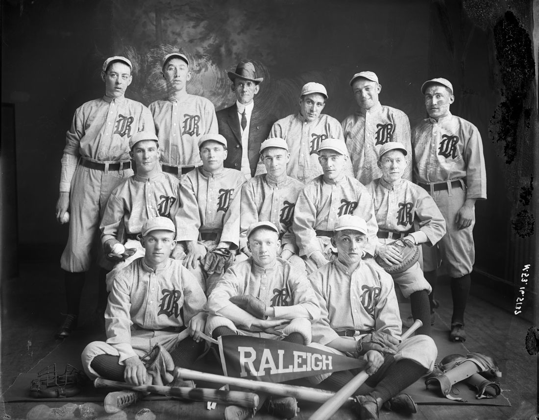
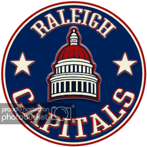
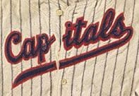
The Capitals identity changed as often as the teams roster, leaving behind a canon of heritage marks. Paul chose to play part designer – part visual historian, building a unified librarby of marks inspired by multiple moments in the clubs past: The sharp black letter of the first teams, the faceted lettering of Carl Yastrzemski’s jersey, & redrawing the elements of the Carolina League jersey to bring it all home to Raleigh.
About the Designer
Paul Tuorto
Design, Branding
Raleigh, NC
Paul Tuorto is an art director and designer living and working in Raleigh. When not designing, he’s probably dreaming of waves or bucatini. He also digs photography, illustration and dry hot sauce cookery. After five years as an art director at Baldwin & Paul, he is currently working freelance, focusing on local hospitality and retail driven clients.