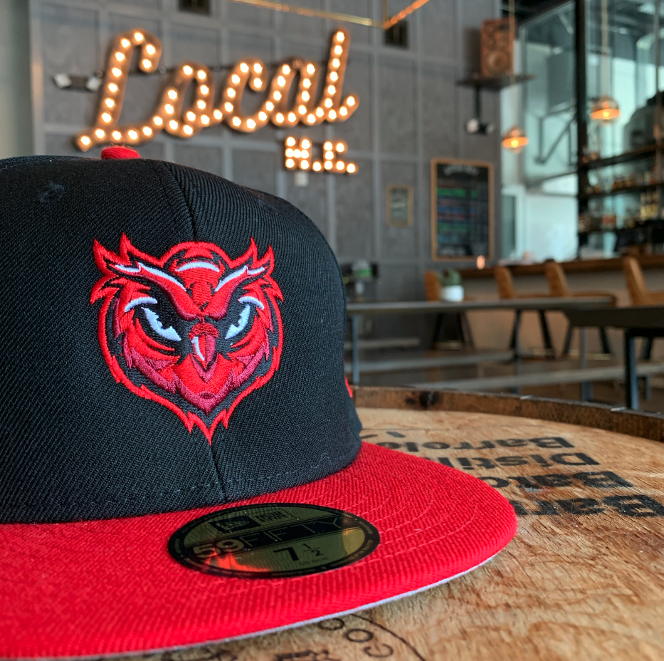
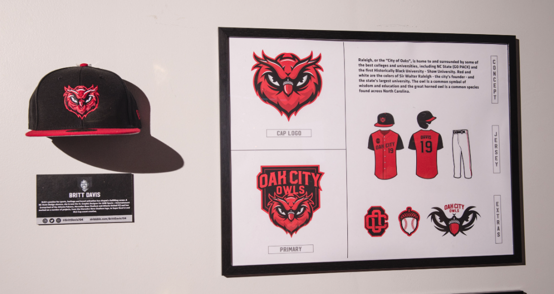
The Concept
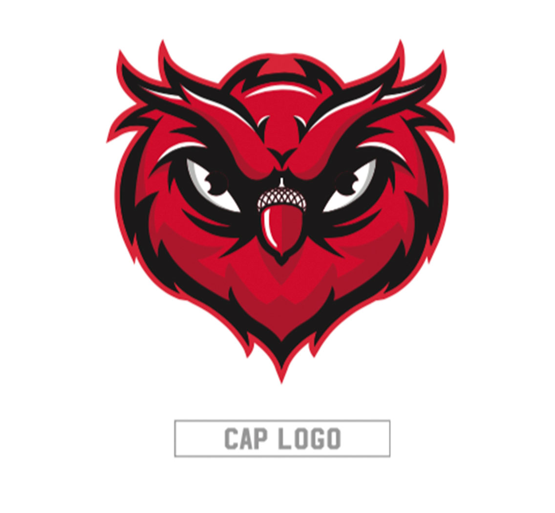
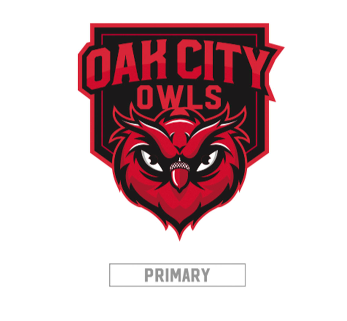
The Oak City Owls was inspired by the area’s high concentration of technology and scholarly institutions including NC State (GO PACK!), Shaw University (the first historically black university) and Research Triangle Park. The owl is a common symbol of wisdom and education and the great horned owl is a common species found across North Carolina. Raleigh was dubbed the “City of Oaks” by its founders for its vast population of oak trees and its official colors, red and white, are the colors of Sir Walter Raleigh.
Behind the Design
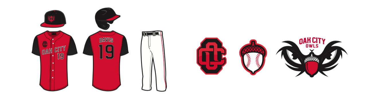
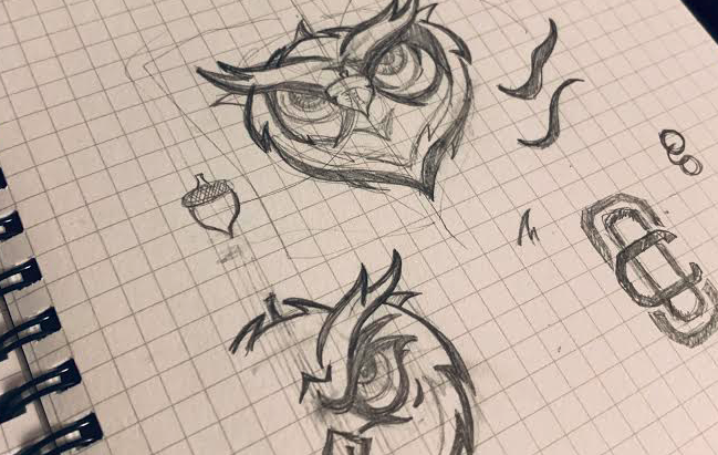
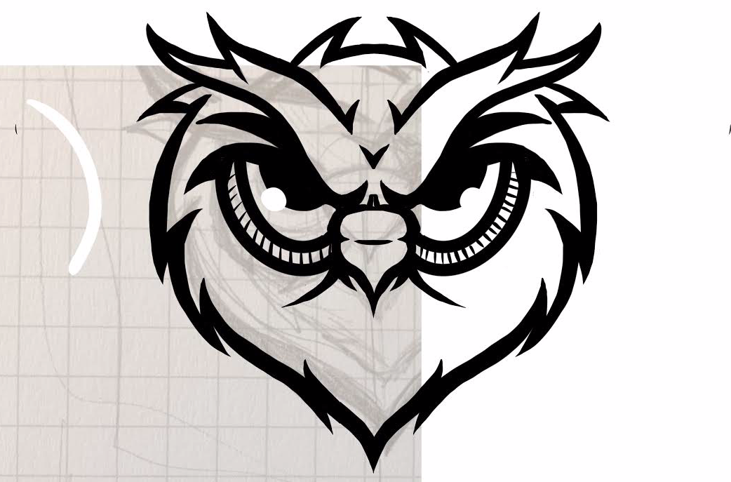
With red being one of the city’s colors, it was a natural choice for the primary palette. The style and color was also inspired by the state’s bird, the cardinal. It also ties into the colors or the state’s largest university and the Carolina Hurricanes. The shape of the owls head and its nose is in the form of an acorn, tying back to the oaks found throughout the city. In addition to the primary mark, the acorn/baseball mark serves as a more playful blend of the city’s nickname and the sport.
About the Designer
Britt Davis
Senior Graphic Designer, AMB Sports & Ent.
Atlanta, GA
Britt Davis’ passion for sports, heritage, and brand activation has shaped a fulfilling career. A NC State Industrial Design alumna, she is now the Senior Graphic Designer for AMB Sports + Entertainment (comprised of the Atlanta Falcons, Mercedes-Benz Stadium, and Atlanta United FC), and has worked on a number of projects, from the Mercedes-Benz Stadium logo, to Super Bowl LI and MLS Cup event creative. Through a combination of educational and professional opportunities, she has designed for ESPN, Viacom, SB Nation, NASCAR, and various athletes and universities.